The “10% Pink” Rule Will Make Your Room Feel Effortlessly Cool
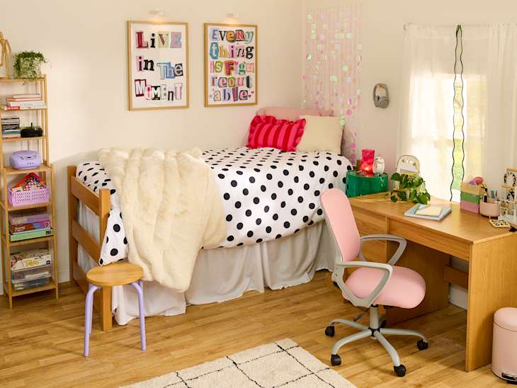
As a pink enthusiast, I always notice when my go-to color has hit the mainstream. There was the mid-2010s reign of millennial pink, of course, the hot pink power suits of the 1980s, and who could forget the bright magenta of 2023’s Barbiecore aesthetic?
What’s next? The “10% pink” rule will be the 2026 contribution to this color conversation. Instead of one shade of pink dominating the color palette, design experts say we can expect to see pink popping up in smaller ways, subtly but powerfully making rooms feel more inviting. “The color pink is just as bold and daring as it is soft and caring,” says Apartment Therapy style editor Emma Dangel.
Whether it’s a throw pillow, water bottle, or piece of wall decor, I look for any excuse to bring a splash of pink into my life, especially my dorm. If you’re about to head off to college or are moving into a new space, here’s how to think a little more pink.
What Is the “10% pink” rule?
To explain the “10% pink “rule, we actually have to back up a bit and talk about the 60/30/10 rule first. When you’re coming up with a color palette to anchor your dorm decor, the 60/30/10 rule can be a helpful framework. It’s an interior design principle that says to use one color for 60% of a space, another complementary color for 30%, and an accent color for the final 10%. The 60/30/10 rule is “a simple way to make a room feel balanced while still allowing fun, personal touches,” says Addison Sapp, creator of Designs by Adds and a junior at Wofford College.
The “10% pink” rule, then, is the idea of using pink as your offset color and pop of personality throughout your room. In the rooms of fellow students that she helps design, Sapp notes that she’s been seeing “more people incorporate small hints of pink rather than using it as the main color.” It plays into the trend of more eclectic interiors that she’s taken note of. “Instead of everything matching perfectly, people are mixing colors, textures, and personal items that reflect their interests, which makes spaces feel more unique and lived-in,” Sapp says.
Dangel says the “10% pink” rule (which she likens to the “unexpected red theory” of yore) is all about “adding in small, colorful accents of a bright pink to otherwise neutral or more subdued color palettes.” She describes it as an “approachable way to introduce more bold colors when you may be apprehensive,” adding, “there’s something rebellious and fun about it.”
Obviously, you aren’t going to write some complex math equation to make sure your dorm decor is exactly 10% pink, but it’s a tool to help you feel confident using the color in your space — you can suss out what works for you.

Why Is Pink Trending for 2026?
Pink is making headlines right now. There’s the recent Y2K resurgence, the popularity of romantic blush pink shades on the runways, Victoria Beckham-inspired predictions of a baby pink takeover, and even Ryan Gosling and Eva Mendes’ adorable pink kitchen (complete with a coral fridge). IKEA declared “Rebel Pink” their 2026 color of the year, calling it “bold and vivacious, playful and expressive,” while noting that it’s “sparking joy in unexpected places.”
And that’s to say nothing of pop culture’s recent rose-colored glasses. Between the upcoming release of the Legally Blonde TV series prequel Elle, Bad Bunny’s iconic pink casita set, and plenty of pink moments in pop music, like the getaway van in Sabrina Carpenter’s “House Tour” music video, it’s safe to say pink is firmly embedded in mainstream media of all kinds. Whether it’s in fashion, music, film, television, celebrity homes, or interior design at large, pink is popping up everywhere.
Beyond the paler pink hues that are making big sartorial moves, Dangel says she’s been seeing a bolder shade show up in smaller ways in home decor (peep this couch in Love Island USA star Kaylor Martin’s NYC apartment, for instance). “We’re seeing bold, darker pink shades just a tad less bright than the Barbie pink of 2023,” Dangel says. She describes it as “punchier than baby pink, but less neon than hot pink.”

Why Pink Works So Well in Dorms
The “10% pink” rule is specifically fitting for dorms because it can breathe so much life into a space, while still remaining soft. “The power of pink is that it adds warmth without heaviness,” says Olivia Erwin Rosenthal, founder of Olivia Erwin Interiors. “It has an ability to make a space feel inviting and layered rather than stark. When used well, it doesn’t feel like a ‘color choice,’ it just feels like part of the atmosphere,” she says.
Dangel agrees, noting that pink is “reinventing itself as a serious design choice and a respected hue that commands attention.” Bringing a blush pink throw pillow and a bold pink desk chair into your room might provide the bit of oomph it’s missing.
As a current college student, Sapp has seen how pink fits into dorms specifically, since you can subtly layer it without overpowering the room. “It adds warmth and personality, especially in small spaces, and pairs well with a wide range of colors,” Sapp says. “I am seeing a lot of students use pink in smaller elements like ribbon boards, calendars, pennant flags, throw pillows, and desk accessories rather than large decor pieces.”

Shades of Pink to Try
Hot pink, peach, and baby pink are each amazing, but put all three in the same small space and they’ll probably clash. Some pinks are so powerful that they work best when paired with neutral colors to offset them — like the bold pink Dangel has been eyeing — which is why they work so well in small doses. For Erwin Rosenthal, highly saturated or neon pinks can work in a space, but “they require more restraint and very intentional placement to avoid overwhelming the space.”
Subtler pinks, on the other hand, can still have depth without competing for as much attention, making them a more reserved way to try on the trend. “Think muted blush, dusty rose, or even a slightly warmer coral pink,” Erwin Rosenthal says. “These tones read elevated and integrate easily with a broader palette.” She notes that she’s been seeing more nuanced tones in interior design, like dusty rose, clay pink, and warm blush.
Sapp agrees that these cheerful but not overwhelming pinks are the ones that are going to be trending, saying, “Pinks ranging from blush to coral will be used as accent colors to add personality and warmth without dominating the palette.”
Still, that 10% rule is key. “Instead of one large bright pink moment, layer smaller touches throughout the room like pillows, a throw, desk accessories, or art,” says Erwin Rosenthal. “Repetition makes it feel intentional rather than random.”
But what about the other 90%? There are endless color combos to consider, and you should absolutely have fun playing with different palettes in your space. Erwin Rosenthal suggests using pink as a neutral and pairing it with earthy materials, deep woods, or unexpected colors like oxblood, chocolate brown, and muted greens.
For Sapp, she’s loving combos like black and soft pink, chocolate brown and dusty pink, sage green and blush, and light blue with pale pink. “These combinations feel more personal and creative, which aligns with the more eclectic, mix-and-match style that is becoming so popular,” she says.
Meanwhile, Dangel has her heart set on one punchy palette: “60% warm beige tones, 30% chartreuse, and 10% pink will give you a bold, bright color palette that feels distinctly modern but still approachable,” she says. “The green adds in an unexpected pop of vibrancy, while the warm beige and pink tones keep the space feeling cozy and inviting.”
Get the Look
Need some more inspo? Check out some of these perfectly pink picks for your space.


This article is part of Dorm Therapy’s Save/Fave List of the hottest dorm trends for the 2026–2027 school year.